Color In Designed Spaces

Color In Designed Spaces
Color influences the human psyche

Monday, June 18, 2018

Design Inspiration


A-Frame Seaside Retreat

By eula biezen - paraizo disegno


As an interior designer, I begin any project by making an assessment of the space to be designed and decorated. I am always left in complete fascination of the enclosures, that is the 3 dimensional architectural space that is my canvas and that houses the functional art that Interior Design really is.


Successful projects need not be large or have high cost, 
Good design is the single factor that makes a project successful. 
I have selected this project by Bromley Caldary as our design inspiration because of its uncontested beauty. This is no ordinary fisherman's hut, it truly is a jewel by the sea, a retreat that is functional and has a meditative quality that is unassuming, serene, emotional and inspiring.

For this article I have selected the A-Frame structure titled as Rethink, by Bromley Caldary Architects. This project was built in 2013, and is located on the seashores of the Fire islands in the U.S. 
Despite its monumental presence that reminds us of the great Pyramids of Giza, its area is only about 2,346 square feet, the average size of a small house. This is a 3 story, two bedroom and two bath sea-villa overseeing the Atlantic ocean. It is comfortable, peaceful and decorated with simple elements that are planned to be a ocean retreat, not a luxury mansion.


What makes this project successful? 
Paraizo Disegno, dives deeper into the aesthetic and functional attributes of this project titled, Rethink, and here are the 10 reasons why.


1. THE STRUCTURE

This project is successful because it needs nothing else that the structure itself, to stand out. The uncommon use of pyramidal shape itself is sufficient to make it stand apart and attract attention. The plain furnishings here are an added accessory for convenience and comfort. 
Nonetheless, even without them the project is undeniably beautiful.

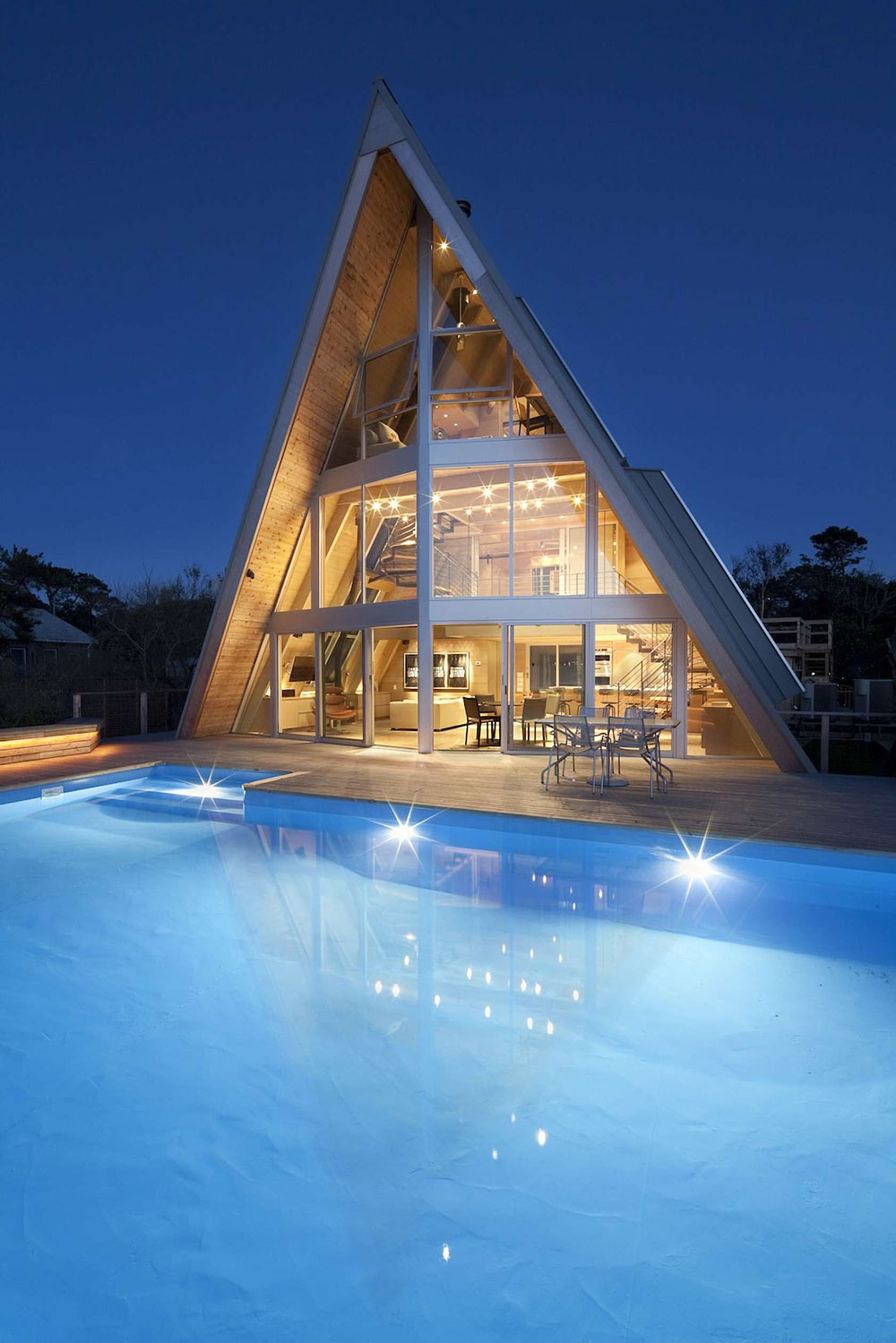
Residential Project - A-Frame Rethink, Bromley Caldary Architects


2. THE AESTHETICS

Here, minimalist simplicity is the undisputed quality. Even so, the entire residence is beautiful, modern and and all the elements display a cohesive and relaxing atmosphere that is quiet, peaceful and providing all the comforts for modern life. 

The monochromatic colors are subdued, soft and informal. Most of the decor is dominated by light wood, with a deep contrast and emphasis on the structural elements that subtly reminds us of a ship's deck and is realized in a dark metal patina. The interior wood is contrasted by aged driftwood colors in soft grey on the exterior. Defining the areas of house, deck and beach.

Harmony and Unity of design is achieved throughout all three floors yet with a tinge of color throughout. All the design elements are kept simple and informal, yet are very stylish and modern.
At night the space becomes warm and inviting, in clear contrast to the cold Atlantic gusts from the outside.


3.  THE VIEW

What is so strikingly about this project is the breathtaking view of the sea, which is the most dominant feature of all. The front facade offers an expanse of window that offers a full and uninterrupted scene of the oceanscape.

The architects clearly demonstrate their understanding of their craft. Day or night the full expanse of the window gazes out to the ocean and takes the full window as natural photography. 
Sunrise or sunset that completely covers the scene from any of the three floor levels. and one could almost see see the midnight stars draped over the sea.


The ceiling heights of the first floor was increased to two stories, or 20 feet, giving this A-Frame structure a large base where to house the living spaces. 
A stunning and dramatic sunset view and very warm interiors.


At night the interior displays a night light show that almost serves as a beacon of style. Dusk could be nothing other than heavenly, with cool breezes flowing though and a soft glow of the interior's incandescent lights that are kept at subdued intensity.

Mornings could be not anymore glorious. 
The window seating allows one to take in the sea air while enjoying a warm cup of fresh coffee.


3. THE LAYOUT 

A frames are known for the slanting walls and decreasing areas at elevation. The layout places the living room, kitchen, bar and dining in one unified space. All the private quarters are tucked behind this space and on the second floor. For this to be successful, a broad base was needed. 

The winding stairs split in two sections is unobstructive  and recessed to the mid wall and divided to the outer walls, the landing serving as an overhead cover for the kitchen and makes it intimate, while also a platform to the bedroom entry. Finally the third floor, which in ordinary structures would be an attic, here lends itself as a sort of lookout. It is functional, not only for the view, but houses the second bedroom and bath, making maximum use of the top floor. 

The great element, are the window sets, expansive and evenly spaced and placed on every tier. They offer plenty of natural daylight and a connection to the exteriors from all levels.


note how the windows slant inward like is found also on ships, 
and how the structure steel and the seating are of similar materials and color.


 The drama of the view is nothing other than asomatous, 
making us to take a deep breath and taking it all in. 
The large window expanses allow floods of light into the interior space. 


The architects demonstrate their mastery of the craft. The vista is what dominates the space. Seating right at the window wall and close to the pool, the ideal place for a light fare, wine and great late night conversations.


4. THE OPEN CONCEPT 

The open concept is intelligently planned. The winding stairs are displayed as part of the master piece, they blend not as structural and functional elements, but as a stage for the grand entry of the actors onto the scene.


Notice how the stairs break up into two pieces, 
the landing serving as the overhead cover for the kitchen 
and as a platform for the master bedroom, continuing on to the third floor.
The seating area and bone white sofa is placed to the side, 
again the windows are surrounding every angle.  

The real structural elements, which are the supporting beams are barely noticeable and blend in with the wood colors. 


5. FUNCTIONALITY and EFFICIENCY

All the rooms in this residence are relatively small. And the tall structure is not only impressive, but makes it the place look monumental and spacious. The areas are defined only by the furniture pieces that are sectioned off in areas of the ground floor, the seating for conversation and small table by the sea. The kitchen and bar, are larger because they serve multiple function for food preparation and informal dining, as well as a bar. Still it can comfortably seat 4 and even six. 

Another feature found all throughout the residence is built-in storage. that give structural stability and some also work as additional seating. 


The windows, as the walls are slanted.

The kitchen small, yet very functional. All the appliances are recessed to the wall to give a clean and seamless look. The oversized bar curves permitting the diners to see each other. It also overlaps the counter space for ease of seating and hosts 4, but can easily allow 6 guests.  

The pantry is not at all invisible, and is hidden behind the kitchen. 
Everything is built-in with drawers for storage and the roof-wall systems on the interior also lends itself to be a shelf space for stemware.


A place suited for entertainment.


6. EMOTIONAL QUALITY

The whole residence, whether it is night or day, dusk or dawn, exudes tranquility and an informal refinement and beach elegance. It is as if this refuge breathes by itself and silently speaks to you. 

The open space on the first floor, almost tells the story of coziness and intimate conversation. The kitchen bar conveys late night entertainment and cocktails. I do not believe anyone would want to retire at night and go to bed. The bedrooms are private and isolated, the bathroom open, light. The upper deck is reminiscent of a modern lookout.


The entire place silently speaks.
Winding metal stairs travel from the first to the second to the third floor.


7. SECLUSION

The private quarters are intimate, restful and the closed in walls and minimal fenestration turn the bedroom and closed areas into a sheltered hideaway.  

In this project, the side windows on the front side maybe large but are are kept to a minimal. The ocean view that dominates and the large picture windows are placed in the front facade, while the side walls are utilized for shade and protection from sun and heat and also partially blocking the side views.

The slanted wall-roof also angles the windows upward giving  view of mostly the sky. This gives the occupant a feeling of isolation since the windows are scars and even then neighboring houses are out of view.  At night the stars are close at hand, and I can only dream what the moonlight would bring. 


Sea-Side Bedroom with an unforgettable view
The scale of everything is small, and give a feeling of coziness and warmth. This abode permeates less light, because there are fewer and smaller windows, but this is exactly what makes it so intimate.


Because in A-Frame structures, the roof is also the side walls, and thus have a double function as protection from the elements, heat and light, and as flow for exterior elements such as wind and precipitation, they have to be strong and sturdy and also thick. 

The exterior conditions of this maritime location make it a must that the walls have to withstand strong breezes, harsh winds and the intense temperatures of hot and cold during the seasons. Thus it also requires strong and thick walls and proper insulation and materials that can survive salt acids. 


8. STYLE


Overall throughout the entire retreat there is a consistent style. 
Uniform color palette, the same wood species is used on all three floors. The style is modern, elegant, minimalist and displays comfort and simplicity.
The pale wood colors are even, light, soothing and make the place serene.
The galvanized metal framing and railings are in deeper dark colors, thus giving it a more natural feel and receding the stairs and making it look more subdued. The darker contrast is also very elegant than if any other colors were selected. 

The bathroom is located on the second floor at the rear side of the residence.


9. LIGHT

The Light-scape was very carefully planned. Natural light seems like a given, if you note the surrounding views, but especially the artificial and night lights was given a lot of thought and planning

Natural light permeates from everywhere and floods into the space during the day. There is privacy in the private quarters, but still enough light 

The nightscape both indoors and out are dramatic. And we can notice the recessed light fixtures are precisely and evenly spaced. The combination of track, recessed and spot lights give out even orange-yellow colors and glow. 
The lumens can increase intensity or dimmed down to a subdued. The pool light is an intense white.

At the opposite continuum of light is shade, and this too is intelligently incorporated, giving shade in the private quarters and the rooms to the rear. 
As there are hardly any trees to be found, the eaves also extend far out to allow shade. 


10. COMFORT

The first key functional element is that the place is open and spacious. Even if you are not there, you just know there is a cool breeze constantly flowing through. And if not, there are fans located where they are needed.

The furniture selection is simple, widely spaced, plain and in mostly soft colors. The pieces are clean-lined, rounded and the selected textiles are of stain resistant materials and leather.
There are pleasing even stripes on the floors and roof-walls and the carpet buffs sound on the second and third floor. 


Soft pastels with tinge of lively colors. Furniture is kept to a minimal.


The overall theme, when indoors gives the notion of being on the deck of a ocean liner. The material elements are light wood and steel frames, and the interior cladding is uniform blending the walls with ceiling. The color palette light and soothing like the sand of the sea. Simple furniture and tapestries, in natural materials of jute, cotton, leather.


This passage way connects the deck to the bedroom and in the middle, is the bathroom.


White was selected for the exterior roof to reflect sunlight. 
In this view we clearly see the window sets and how they are placed to permeate light and and allow privacy in the back rooms.


A distant view of the project reveals its simplicity and unassuming character. It is primarily a seaside retreat that offers isolation and perhaps also time for contemplation or meditation. To me the sound of crashing tides would be the only music I would sway to and the vista of the ocean the only painting on which I would fixate my gaze. 


Notice how the eaves hang far over the walls, to give proper shade to the upper rooms. 
Same for the rear entry doors that are recessed to provide shade.


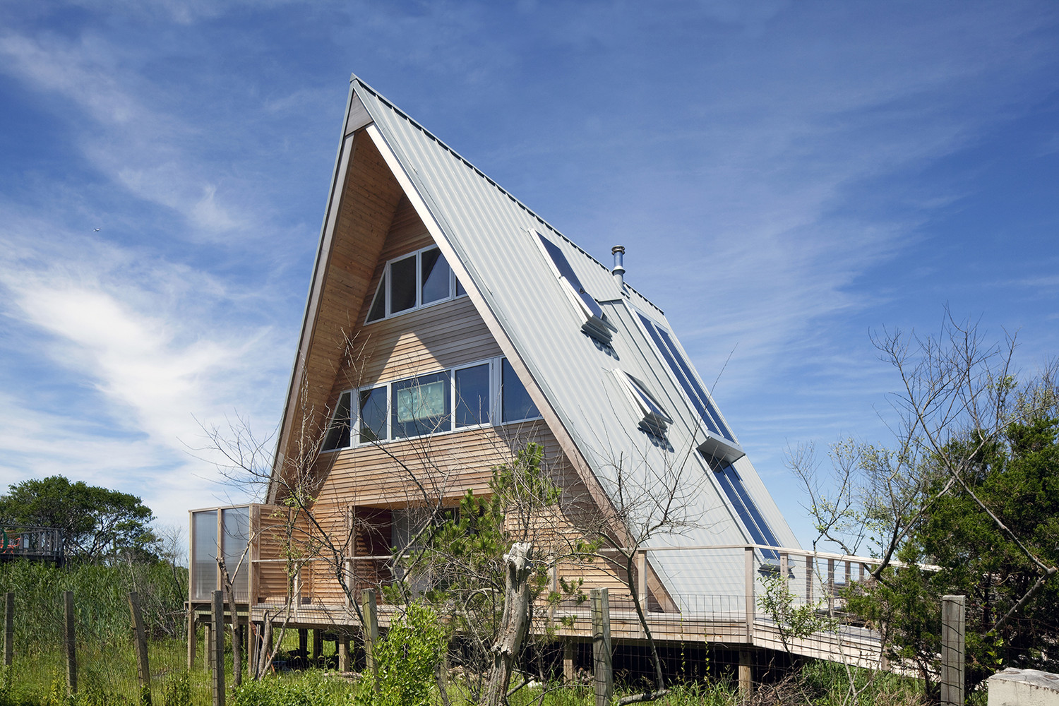
There is a natural wilderness in the surrounding area and at the rear of this residence, that is complemented by the simple fencing. The vegetation is mostly that of a marshland and because of the salty and moist soil quality, which is also like moving quicksand, the architects have decided on raised piles to give the structure stability, strength and provide durability while protecting the materials from the acids of Potassium nitrate or saltpeter.


A beautiful symmetrical view of the seaside cottage.
A daytime view of the prematurely aged deck. 
Wood ages to grey tones giving a natural transition to the colors of the sand. The pool giving a natural accent color to the scene.


In this view one can also appreciate all three floor levels, 
the living spaces, the private spaces and the upper viewing deck.

All architects know that any project considers and incorporates its surroundings as part of the overall scheme. In this one, the Bromley-Caldary Architects have successfully brought this element to its maximal heights. The 3 story design, the facade and the view it offers, the A-Frame structure that deflects wind forces upwards, cooling the interiors and also the open  space on the interior, that is airy, breezy 
and gives a view that lasts a  lifetime in memory. 

Serenity and solitude describes this project.
The simplicity is completely befitting and despite the informal style, this project is elevated to a status of a masterpiece. This and all of the above criteria are all the reasons, why 
Paraizo Disegno has chosen it to be our design inspiration. 


Tuesday, October 9, 2012

Color in Design

Color is one of the fastest, easiest and most effective ways to truly enchant your personal headquarters. Color is the known psychological mood-setter and showcases your individuality by the sheer power of choosing color and color combinations that reflect you and instantly reveal and reflect your personality. 
Color also expresses emotion and the beautiful thing is that there are no rights or wrongs with color. It all goes well according to your color preference and personal taste. Many people are gaining a lot of confidence expressing themselves using color. Bold, soft, feminine, masculine, impacting, dramatic, cheerful, formal, elegant, dignified, peaceful, all is well with color. Colors are almost invariably associated with elements in nature, and it is only natural since our entire external world is displayed with vibrant shapes and colors. 


Why color matters?
Color plays a significant role in our visual experiences of a space. It is a subliminally persuasive force, it captures attention, relaxes, stimulates or irritates, and send powerful messages to our brain. 
There are many aspects of color: human associations to color, ranging from each individual color and their particular or general qualities and attributes; cultural interpretations and use of color. Designers, professional's and amateurs recognize the importance of right use of color. 
Color's first association is to nature. Sea and skies are associated to blue, Green to foliage and trees, Snow invariably linked to white and grey. We draw from nature as first inspiration and draw its pigmentation for the myriad of objects and artifacts that are trying to mimic from it for use in our lives. 
Colors are drawn from nature to dye textiles. looms and paint to give live to our interiors by the sheer power of color. 
Color as a design element is one of the most impacting elements that influence decor.


Color Theories
Color theory encompasses a multitude of definitions, concepts and design applications, enough to fill several encyclopedias. However, there are three basic categories of color theory that are logical and useful: The Color Wheel; Color Harmony, the context of how colors are used.
This blogger only includes colors as used for Design purposes, it excluded graphic or web designs, computer imaging, photography, theatrical use or cinematography or any of the other disciplines that use color and light. 


The Color Wheel

The most used and most useful tool for showing the full color spectrum. It is a color circle, based on red, yellow and blue, developed over time in the traditional field of art.This torus presents a logically arranged sequence of pure chromas, with variations in hues and tones.

First developed by Sir Isaac Newton in 1666, this circular diagram of colors has since then been studied by scientists and artists who have since developed numerous variations of this concept.


Color Harmony

The basic color theory for color combinations are: Achromatic, Monochromatic, Direct Complimentary, Split complimentary, Triadic, Tetradic and Analogous. 
Although these terms may not mean so much to occupants, every competent Interior Designer must be acquainted with them and be able to show their clients examples of these schemes and their client's inclinations when doing a client personality profiling. 

Achromatic, means sans-couleur, thus only black and white, and perhaps shades in between, very effective, contrasting and many times modern and often using lots of patterns. 
Monochromatic, or monotone, means uni-color, thus using many shades of the same basic color, like the popular beiges this scheme is very soothing and can never go wrong. 
Direct Complementary: Here two basic opposing hues are used and harmony is not necessarily the goal. Splits are used to achieve stimulating and exciting effects. 
Split complimentary:  the objective is to create a very colorful and lively space. The dominant color is complemented by two opposite colors from the wheel, for example yellow with dark purple and blue. 
Triadic: By using an equilateral triangle to select 3 directly opposing colors from the color wheel, for instance, red, yellow and blue, or green, purple and orange or any variation of this method. The goal here is to create a lively space using strong and contrasting hues.
Tetradic or double complimentary scheme is the richest of all the schemes because it uses four color arranged into two complementary color pairs. Most effective when using one dominant color and subduing the other three. 
Analogous colors: Are those adjacent to each other on the color wheel, for instance: green, yellow-green, and yellow. Or red, fuchsia and violet. Analogous color schemes are often found in nature and are pleasing to the eye. The combination of these colors give a bright effect on the area and are able to accommodate many changing moods. When using the analogous color scheme,one should make sure there is one dominant hue as a main color. 

In addition to these color combinations it is noteworthy to explain the neutrals and accented neutrals. Neutrals are the beige, browns, grays and blacks or somewhat variations from other colors with strong neutral tones. Accented Neutrals are using the above colors adding one strong additional color to set the tone for the space. 

It is valuable to add a note on warm and cool colors, since all these have a definite effect on the human psyche. Warm colors or receding colors, include reds, brown, yellows and oranges, these set very inviting and cozy atmospheres. 
Cool colors, or advancing colors, are very calming and soothing, these include blue, green, and purples, and have been known to slow breathing rate, relax muscles, lover blood pressure and body temperature.
The stronger the color, the more intense this 'cooling' effect tends to be. 

Color attitudes
Could you imagine our world if it was created colorless or achromatic, meaning only in black, grey and white?
Color is the impulse for visual experience and interpretation and is not the same for everyone. Color can also be very subjective, it does not have the same meaning for all individuals. It may evoke one reaction to one person and an entirely different reaction from another due to individual experience, cultural background and personal preferences. In addition there may be a positive or negative associations with color, and as outlet for emotions. 
For example; White in the Western world for instance is associated with innocence, weddings, snow, in some other cultures it is associated with mourning. 


Colors and shapes.
And one more factor added to color: If colors added interest to your space, try some patterns and shapes!  
Shapes have to do with overall items in the space, while patterns are specific lines or curves in one item, like textiles. 
Shapes and patterns, natural, geometric, paisley, or sternly abstract like stripes, zig-zag or solids. All can benefit and add personality to your space and make it uniquely yours. Accessories, walls, window treatments, panels, doors and door-frames, textile, upholstery, window-coverings or any other surface, form of ornamentation can dazzle with a little bit of texture and patterns. There are techniques to effectively create harmony with different colors and shapes. And these are the 3 main rules of thumb: Scale, Shape and Color. 

Color Uniformity: One can mix scales and shapes as long as the colors are uniform and harmonizing. 
Mix Scale: use one large scale, like an oversized print, one medium and one small to balance the patterns. Three different patterns usually work well, I would advice caution using more. 
Mix Shape: Shapes can be geometrics: squares, stripes, circles, plaid, diagonal, zig-zag or they can be organic: florals, paisleys, jaquards, vernacular and of course we all know solid colors with perhaps visible texture, you may think of a plush, tube, ribbed.
The most pleasing mixes will include a linear pattern like striped or plaids, perhaps both but in different scales. Florals are very popular for country and feminine rooms. 


Gender differences in color.
Oh yes, genders make a good example of very different attitudes when it comes to color. Males tend to select dark and deep colors, and the well known tendency towards blue is now expanded with dark browns, greys, blacks, hunter greens, mauve and the so called 'masculine' colors. Again there are exception rules in personality and color choices. I'm sure you have noted the highly energetic neon green that creative, young and vibrant computer analysts or advertising designers love. 

Females lean toward a lot more open choices and wider selections in color. Again note personalities have a grave weight in client's preferences. 
As singles these preferences should not cause too much strain, but when discussing choices for couples it is important to note their different chroma-choices. As these will be primary considerations in making designs work for couples. Discover the color likes and dislikes for both, and exclude any dislikes in designs that are meant for their use. Sometimes it works to combine the two or several favorite colors and work them into the color technique. 


Age differences in color preference.
Oh yes, age matters in color choice. We all remember the pink fascination of young girls. For younger children their natural vibrancy and high energy call for bright colors, but especially through the ages of 6 to 9 there is an euphoric draw towards pinks and purples, also lots of sparkle and glitter. The fascination is explained by scientists and color experts as coming from being a new, novel and a "created" color and a desire to be 'different' and to 'stand out' in the youngsters view. 

In young boys there is no strong inclination towards any color choice, the cultural associations with blue are more given to them, then self chosen. Young boys seem to like a greater variety of colors that include the warmer colors, including pinks and reds, but some parents make the selection of blue for them.

In the older generation there seems to be inclination towards softer colors like pastels, especially if very advanced in age. Brain stimulus using bright colors tend to irritate the elderly.
The other choices are with earthy tones and darker tones.  

With adults, we know that the tendencies are purely by personality and cultural attitudes and these are as wide as the color spectrum itself. It is easier to note those choices of color that are disliked and work with a color palette that excludes them. Simply ask yourself how a certain color makes you feel or what you think of  any particular color.  
Some colors become 'trendy' and fashionable for a certain period of time, others are classic and timeless like the achromatics: black & white. Those regions that enjoy 4 seasons we note changes in colors choices as nature and weather change.   

The spectacular news is that there is no right or wrong with color. As long as you like it, it is ok to use any color or color combination. 


Traditional and Spiritual beliefs.
Many cultures have assigned colors to major events in life or to theosophical rituals.
Wedding known for white gowns in the western culture, in the Indian is a color for mourning.
For weddings the Hindi and Japanese use bright and shiny colors. 
The norm for funerals in the western world tie to the dark tones, black, dark grey, navy blue; browns may not be so common but be warned that red would be considered an offense in some regions as it signifies energy and blood. 

Purple in the western world is a spiritual color and in medieval Europe was very expensive to create the die, so was also accessible to the rich.


Metamerism, a phenomenon of color and light. 
Metamerism occurs when colors change when viewed in different light sources. When a particular color in a material, for instance, carpet flooring or walls, if displayed in a showroom lit by warm incandescent lighting would reflect a very different color then if it was installed in an office with cool fluorescent lighting. The type and quality of light, natural or artificial shall be very different depending on the source of light. it is said that it is distorted, I would say that it is changing. But if it has any effect on your desired results in exact hues, thus saying you like it or hate it, then definitely take metamerism into account. This will have a change in color especially with beige where cooler lighting is famous for sucking the life out of beige. 

A final word on color.
There is no right or wrong with color, but the caution here is that once the color is up and you are dissatisfied with it, it has to be done all over again. If you have doubts, ask for small samples and paint a small section of the walls with the several color choices. Wait a full day so that you can see the color during day with natural light and at night with artificial light.
Discuss color dislikes with the significant people who will share the space, and exclude any dislikes. 

And finally, ...
Harmony can be defined as a pleasing arrangement of parts, whether it be music, poetry, color, fashion, art or even cakes and all food presentations. 

In visual experiences, harmony is something that is pleasing to the eye. It engages the viewer and it creates an inner sense of order, a balance in the visual experience. When something is not harmonious, it's either boring or chaotic. At one extreme is a visual experience that is so bland that the viewer is not engaged. The human brain will reject under-stimulating information.
At the other extreme is a visual experience that is so overdone, so chaotic that the viewer can't enjoy it find it irritating and can't stand viewing for too long. The human brain rejects what it cannot organize, what it cannot understand. The visual task requires that we present a logical structure. Color harmony delivers visual interest and a sense of order. 

In summary, extreme unity leads to under-stimulation, extreme complexity leads to over-stimulation. Harmony with color is a dynamic equilibrium and a very important aspect of successful designs.

I would love to invite you to read my next blogger which will come out mid-January.
Thank you very much for reading


Monday, September 10, 2012

Curb Appeal

What is Curb Appeal?

Curb Appeal is something realtors have known for a long time and is the industry jargon for the first impression that passersby make when they drive by your street and house. The curb appeal of your home makes a good impression from a distance. The handsome design elements of your home, a welcome entry, well maintained front yard, harmonious outside colorscheme, alluring focal points, signature details with atractive and personalized outdoor accessories, architectural character, well designed landscaping, effective nightscape and lights.
Homes that stand out create presence in the neighborhood and demonstrate creativity, innovation, and charm. At the same time they increase not only the real estate value of the house, but also the zoning market value of the neighborhood and area. That is why in some areas real estate is more expensive then others.
What would be a good reason to upgrade the curb appeal of your home? Well, there are many. Pride of place, an innate drive for high quality of life, equity value, personal expression, creativity, leverage and social status It is always  a good idea to upgrade your home even if you don't intend to sell it. But, whatever your motivation, Let me show you how.
The main points are these:

  1. ARCHITECTURAL CHARACTER
  2. DESIGN ELEMENTS, STYLE
  3. ACCESS AND PATHWAYS
  4. ENTRY DOORWAY
  5. COVER AND SHELTER
  6. LANDSCAPING
  7. ELEVATIONS
  8. NATURAL AND ARTIFICIAL LIGHT
  9. COLOR
  10. COST & BUDGET


1. ARCHITECTURAL CHARACTER
First of all, understand the character of the setting and site of your home. It is advisable to evaluate the original architecture and identity of your house, by studying its features and materials; the roof and roof-shape, wall height, chimney, cupola's, projections, an additional wing, recesses, arcades, balconies, porches, architectural details, windows, bay-windows.

Many times it is desirable to stay true to the original architecture of the house at others to enhance or emphasize certain elements. There are features that can look outstanding if improved with color and light but also by allowing their visibility from a distance. Identify the visual character distinguishing your home, like the overall shape, materials, craftsmanship and decorative details and the district, region, city, neighborhood and country. Then accentuate the attractive features with color, light or placing or reducing landscape to allow their visibility.


2. DESIGN ELEMENTS & STYLE
Understand the setting and design context. Can they be considered as an example of a historical period? Is it an entirely modern concept? Is it a themed concept that reflects your personality and cultivated taste?
Often homes are related to a specific architectural style, such as Gothic revival, farmhouse, arid-zone coves, one-story bungalows, Meditteranean or Art Deco. Look at the roof and roof shape, chimneys, pediments, cupola's, projections, recesses, arcades, balconies, cornices, porches, windows, bay-windows and empty areas, these are the distinct character features of your domicile. Can these elements be emphasized as part of the appeal of your personal abode? 

3.ACCESS AND PATHWAYS
Pathways leading to the front entry are an important element and a variety of interesting design features and techniques can be employed to create a stellar curb appeal. First and foremost have safety in mind. I recommend to select a slip resistant walkway, one that does not retain water on the surface and whether brick, concrete or tile, make sure it is well lit. 
Depending on the distance and elevation between property line and entry, make the steps as gradual as possible, thus making the height no more then 4.5 to 5 inches tall and the steps as deep as possible and ensuring that they are clearly visible with light and/or border rims. 

Symmetrical balance is very appealing mostly with formal and low front lawns. I find assymetrical best suited for a warmer welcome.The most inviting pathways are curved leading to the front door and have a plateau surrounding the entry. The more formal entries have a straight, direct and non-deviating pathway.


4.ENTRY DOORWAY
To create dazzling and inviting entry ways and front doors we need to become acquainted with a few industry secrets. A good and well-known technique are the over-sized and well-lit entryways with adornments on the sides. Special character on the otherhand, is achieved when considering not only the door in itself and all the surrounding elements but by selecting special signature choices that reflect your individual attributes and utilizing your home as an outlet for their expression. Many functional elements such as unique door knockers, bells, peepholes, mail-slots, house numbers, mailboxes and special signs can be incorporated in very singular ways.

Larger elements such as arches and curves send a subtle, soft and warm visual message, while straight lines, columns and cathedrals a more stern and formal one. The more foliage, the more romantic, the less flora or perhaps clean unsprouting stems the more these are considered as modern and sleek. The door itself should allow ease of entry by its size and the orientation of the door-swing. Most main entry doors are given focus through their design, color, elaborateness in ornaments and are differentiated from all other doors, sometimes by contrast and with embellishments and beauty. Nowadays we find all sorts of strikingly beautiful patterns for wood, glass and metal entry doors matching or complementing them with equally beautiful hardware sets. The overall combination of all these different elements of design, texture and materials creates a synergy that come together in salient entries.


5.COVER AND SHELTER.
Overhang, covers and port corchères are essential details if in your climate zone there is a lot of precipitation. When included overhangs become the design element you avail yourself of to gain some extra points in terms of curb appeal. Covers are mainly to protect from weather, especially if there's frequent or high volume traffic but an added value is the chance to employ them as designed elements of the front facade. They can be extended from property line to front door, or hanging directly over the entry. The variety in shapes and techniques should give you plenty of choices in mouldings, cornices, crowns and arches or vine arches, pergolas, awnings, plexi-glass to invite style and attention. With smart implementation, covers make stunning and very attractive in addition to protected entries.
Choose a style that fits in well and again you may opt mainly for formal and elegant or warm and personal. Design the cover raised at least 10 feet and with an area of 6 feet or larger extended from the front door, this way you can add many smaller interest items later without cramping the space. If you have uneven landscape or hills, many innovative and creative ideas derives from unusual settings and make even more interesting settings for entries and covers.   Plus remember those long goodbye's that ride out outside the front door? They all take place in the front, right?


6.LANDSCAPING.
There is the common idea that in order for a house to have spectacular look it must have full forest-like and lush landscaping. Yet we have seen many examples of very attractive homes in the city or dessert where little or no plant-life is visible at all. Having a garden with full plants means you have the time and are willing with the up keep in maintaining the garden. Successful curb-appeal does not absolutely require plants or to have attractive landscaping. Sculptures, urns, pergola's, low lawns, with gravel, sand or rocks may work as well. The key aspect is to have a balanced, clean and manicured front yard that looks complete, finished and with light and color appeal. The best designs in landscaping combine nature and culture. 

Landscaping, is the largest segment if you have a large lawn, also because of its prominent  site in the front of the house.  If you decide on landscaping, design the entertainment / activity areas with direct access first then the pathways leading to them. If you enjoy privacy but desire a front porch or a secluded area that are not directly in view, include them now, and finally design the landscaping around these. Should the climate in the vicinity permit and your preferences are to have a plant garden, make a list of the plant types that are suitable for this type of climate and then check off those that you like, based on ground and potted plants, leaf size, shape, color, height and width. Start with the larger items, like trees, then hedges, shrubs and flowering plants. Add additional outdoor elements, such as fountains, pools, statues, columns, pedestals, mirrors, or others to add interest and variety. Finally run pencil lines for the irrigation system. Make sure to have good contrasts for daytime and nighttime. 

7.ELEVATIONS.
Elevations and levels in areas add interest whether they be sunken or raised. Most exterior elevations of a home are by raising the entry at the front porch and sunken in the rear. Elevations can extend  an inviting and warm welcome by offering delightful paths, interesting visual elements,  perhaps even some animals, birds, fish, views of the surroundings, perhaps even pleasant breezes and scents from your front lawn to the door. There are a few different styles for elevations, some plateau, other rolling curves, steep straight up steps or flat. Layering is the most effective way to showcase varied plants and garden features and many times capture the eye before the front door does. It allows for several elements to be displayed at the same time.


8.NATURAL AND ARTIFICIAL LIGHT.
Light helps to set the ambiance and it is no secret that light effects at night help you display a spectacular show if you can avail yourself of just a few clues to produce magnificent night-scapes. 
There are two suggestions I'd like to reveal to you, and these are to consider the lights permeating to the outside and the lights at the exterior side that highlight your house's architectural features. There are two reasons to light up outside, one is for safety and clear vision of paths and the other is to add visual beauty and interest to special features. What needs to be lit? For safety: walkways, steps, doors, exterior entertaining areas and porches. For visual interest: walls, special architectural details, like water pools, fountains, statues and  trees and some plants so that they become visible at night. 

And if light in itself is an attractive feature, do not underestimate the shadows that create interesting contrasts when falling in the right places in the evening time. Nowadays with so many options in solar powered energy even less of a concern in terms of energy consumption. For exteriors usually low intensity, low voltage is used for the smaller light pools. Remember that the indoor lights permeating to the exterior may already cause a dramatic effect. But taking this aside for a while, mind the height of your home and its walls, and special features to accentuate. In addition to this again safety and prevention of accidents by emphasizing steps and changes in level.
One more tip, is to remind you of special occasions and festive seasons where you may want to scale up the display a notch as to regular seasons where a more even light use is more appropriate.  It would be smart of have outlets, and hooks  laid-out  so that it becomes easier to add festive lights later.

Daylight
Natural light has a lot to do with the sun-orientation and it's intensity. There is not much to be done with natural light during day-time, except to adjust to its orientation, create shade and to filter and reduce its strength. Another aspect is the wind-flow and direction to cool off from those beaming sun rays for ease of vision and human comfort with high temperatures or to create windbreakers for strong gusts especially in extremely low temperatures. 
Toldo's, hedges, pergola's, arbors and trellises all available in a myriad of designs


9.COLOR
Moods are set with color. Outdoor color schemes are usually very subtle and many effects can be created with the combination of color with light. Light or Dark colors are not right or wrong, these too match personality and architectural character and many homeowners today have gained more confidence in choosing house colors. The traditional white and light colors are being replaced with bold dark blues, greens and browns and even daring red shades and the whites that were once perceived as the norm and safe choices are gradually receding and more favored are tinted neutrals that play off landscaping and other building materials. These are increasingly being used as are mid-tone values of neutrals. But in truth all colors are fair game: stark whites, contrasts, matching color blending in with the landscaping, monochromatic complimentary, analogous or triasic.
If you want your home to stand out, step outside the convention and be the first or only terracotta house in the block. Important is the the overall theme has to be harmonious

Take a photograph of your home both during daytime and evening and appreciate its features, then decide which features merit attention so that color and light are best reflected on them. Heavily wooded gardens make colors look darker due to shade and bright colors look better in sun-intense areas and too dramatic for the northern hemisphere. Darker colors also make the house look smaller, but more substantial, this is especially important for small lots. 
As easy as color is to instantly improve curb appeal, don't forget that mistakes in choice have to be entirely redone.  If you enjoy cheerful and sunny colors, choose darker hues like deep mustard yellow or dirty yellow, bright canary may not be the right choice for exterior walls, but perhaps the door or the door frames, maybe some flowers or accent tiles. For walls the colors are always more subtle. 

A few more ideas on color and paint works. Consider the unchanging colors of the roof, shingles, bricks, slate, stone veneers. Another is that it is best to 'hide' unattractive elements such as gutters and other imperfections and body trims by blending the same tones and not use a different color for these functional elements. Accentuate interesting architectural details. 

Lastly, Don't be afraid to be 'you' Did you ever notice that flamingo-pink or the bold rustic house that is different but just looks so perfect?


10.COST & BUDGET
I suggest to make a list of wishes and wants first, boldly and with no apologies as to what you would like to have, then upgrade or downsize on budget. Simply because there is no limit to what could be spend on home improvement and in this way you will find yourself naturally giving first choice to your prime preferences according to budget and taste. There is never a minimum, only a maximum and you know how much this is. 

The main thing is to have a true sense of satisfaction after the facade is completed. Invariably you always find it was well worth it and that the money was well spend and the value of your home is always increased.
If some elements are beyond your reach they can always be included later. Just make sure the most essential elements are included in the first phase of development. It would be more costly to add irrigation systems after the entire facade is finished. Another variation is to stretch  the changes over a period of time, say 6 to 9 months or allot a percentage, say 15% each time on the major elements, then purchase the smaller items last.
Also, you don't have to eliminate all choices, you may reduce some to a smaller size or place them elsewhere. Would the sculptural fountain look better in a corner, centralized or in the backyard?


A final note....
.. about curb appeal. It is important that the design honors the original architecture and that the house is true to the owner's personality and that it blends in well with the surroundings. 

How to evaluate your home for it's curb appeal? Here are a few questions to ask: How long has it been since the last overall maintenance was done? Is the overall appearance, the windows, color, doorstyles outdated? These only look good with period style houses. Is the facade 'tired'? the gates and doors hanging, the windows or gutters sagging or warped and portuding? Has it fallen in disrepair and damage? Is your front yard well maintained, or does it look like a dessert or an abandoned lot? Are the plants sheared and manicured, roots crawling, pots shining and undusted? Is the entry inviting, with light and color? Is the roof discolored, peeled or missing some tiles, or shingles?

Finally I want to add, curb appeal has nothing to do with the size of your house or it's cost. It has to do with a finished and complete look, no matter how elaborate or simple. And don't forget about your own likes and preferences.  Inwardly you know what styles you would be inclined to, incorporate them into the overall design. If you admire them from pictures of other homes, you can create a miniature detail from these. Be creative and have confidence into your ability to make a spectacular welcoming and inviting presence with your home. Lastly, with these few guidelines, let me also say that there is no fixed rule, and if there were, there are always exceptions to them, go with your inner guide into what feels right, and then as you plan and execute them you will find yourself refining and modifying, always improving the initial concept.

Being different can pay off richly. Do you want to match the look of the other 30 homes that have a sago palm in the front porch? Be yourself, If you love plants but live in an arid zone, this too could be a feature to stand out as the oasis in the neighborhood. Or same with a lighted metal cactus in the middle of the winter season. 
Houses that were once unassuming, barren and exposed to the street, with unadorned yards. with the addition of simple architectural features and new landscaping, they have achieved privacy, grace and better defined entryways that benefit the neighborhood as well as the homeowner. Assuming you have no desires for absolute privacy, prefer no high walls and courtyard, I suggest that in the next few months,  you add some pizzazz and deliberately ask for some attentions from drivers by and be the one to stand out from the curb!

Thanks so much for your attention, see you again for the next blog. All about homes.
Please post comments and I also appreciate suggestions for blogger articles.
e-mail: eubiezen@gmail.com